With Givenchy ads I felt like I was looking at a slow motion documentary about this amazing surfer/vampire tribe, so dark but so attractive. I also loved this collection particularly, the way Riccardo Tisci translated the surfers elements to a very cool, fashion context was Delish!
Jil Sander on the other hand was a surprising good thing, they have such a strong full white and bright image that when i saw this ad I was puzzled for a minute. But I really liked to keep looking at it and it gave me a very artsy vibe. I wonder about the meaning behind this ad - would it be inspired by the dramatic Alfred Hitchcock? A very dramatic exit from Jil Sander by Raf Simons?
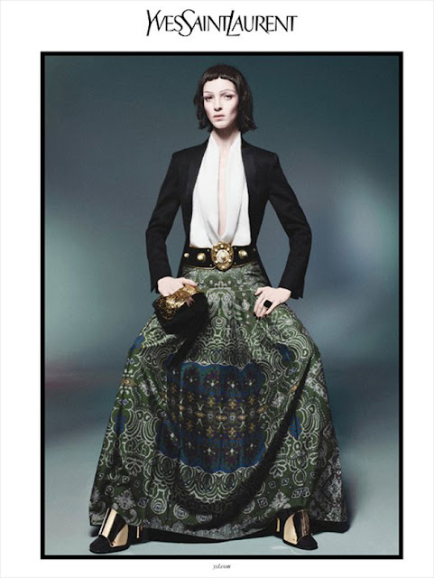
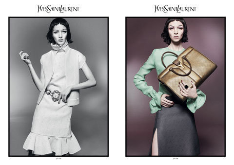
Following the artistic vibe was Yves Saint Laurent. Amazing make up and hair, and the awkward posing makes it really special, Mariacarla Boscono's hands make the shots.
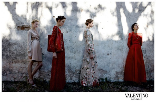
This season Valentino's ad was really a great surprise for me, it felt so different than the brands much known image. This is more girly and ethereal, dreamy where the previous luxury doesn't play the leading role, is more about the romantic feeling.
This Giuseppe Zanotti ad is one of my favourites. Anja Rubik is brilliant, the background is amazing, is also dreamy but not like Valentino's, this is a surrealist dream where everywhere you look you see this girl.


No comments:
Post a Comment